Project Reveal: Santa Teresita III
- Jul 5, 2020
- 4 min read
Updated: Jul 22, 2020
I'm finally getting to share before + after photos of some of my favorite rooms from our Santa Teresita project! This is the third and final reveal post for this mellowed-out French Country home in Santa Barbara. You can check out Part 1 (here) where I feature the amazing Kitchen and Family Room. Part 2 (here) features the stunning Formal Dining and Living Rooms. Scroll down to get the details on all the bedrooms, and the Playroom that you're going to wish you had growing up!
First up -- the bedrooms! There is one bedroom located downstairs, and three additional upstairs. The downstairs bedroom is the room guests typically stay in while visiting, and is located adjacent to the remodeled bath that we shared last week. Now I'll just remind you that all the before photos are from the real estate listing when the client purchased the home... but they were able to look past some of the very distracting elements (like that red carpet that looks like it's straight out of Caesar's Palace in Vegas) and see all the potential!
Before


Naturally, the carpet was the first thing to go. Did I mention I don't like it? Haha!
Isn't it amazing what some new carpet and a few coats of paint can do for a room? The classic furniture and fun bedding doesn't hurt either!
After

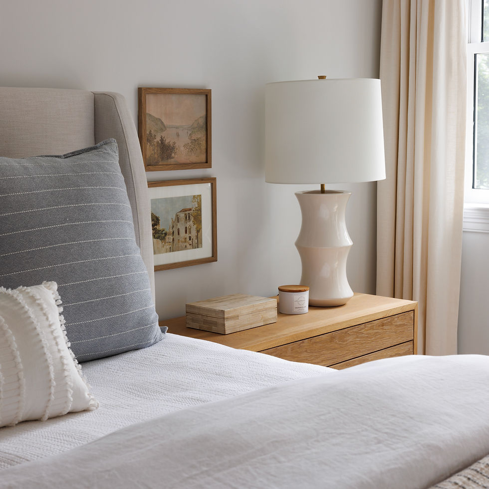
I just adore this bedding. It adds so much fun, playful texture.


The Chinese Batik pillow at the front is from one of my favorite pillow ladies: Danielle Oakey Shop. Take a risk with your bedding and play with texture, color, and pattern! If you keep the furniture, rugs, and artwork classic and timeless, you have room to change out the bedding throughout the seasons or between guests.

Now on to this special red wallpapered room with a very unique light fixture.....
Before


Check out these monkeys!!! I can't decide if it feels like it belongs at the circus or Cirque du Soleil.
After

How amazing is this transformation! You all know how much I loooove blush...so it's no surprise this feminine room with accents of blush & brass throughout ended up as a favorite of mine.


Design is so much more than just beautiful spaces, and I'm a strong believer that form needs to follow function. What's a beautiful room if it doesn't serve the purpose you need it to?!
That's why we created this desk situation next to the bed instead of a second nightstand. It's still beautiful and works perfectly for the hard-working student who gets to call this stunning room home.


The Kate Fisher Art was the perfect finishing touch to pull everything together!

This third room has amazing french doors and a paneled ceiling....but you guessed it - more monkeys! This time on wallpaper, and they had to go. We continued the touches of dark blue from the downstairs bedroom and took style notes from the beautiful french door hardware.
Before

After


master bedroom before


after


This master bedroom had ample space for a king bed and a full seating area to enjoy that spectacular view! The mix of white washed wood, navy, and white will never go out of style, and the rug became the perfect mesh of all of these colors!
I had always thought that rugs on top of carpet was a silly idea, but as soon as we laid this rug down in the bedroom, I knew what I had been missing! Imagine how empty this bedroom would feel without the darker rug to ground the new light and bright space.
This rug is stunning and helped bring some much needed contrast and character to this master bedroom. Plus, I think I found the perfect pillows from @shoppemarineandco and Myhavenhome to pair with them, wouldn't you agree?


The Playroom Before


Each space poses its own challenges and some are much more difficult than others. The main challenge in this space was maximizing the useful area and sleeping arrangements despite the awkward roof lines. We included a daybed with a trundle bed and a chair & a half that doubles as a sleeper to make sure that there is enough space for grandkids! This allows for lots of playing space during the day too.


I love when homes are able to tell the story of a family...who they are, how they live, where they have been, and the things that have special meaning to them.
We even tried to carry that over to the kid's playroom by creating a place that inspired creativity. One of my favorite parts of the room are these prints of the original patents of some historic toys and inventions...Barbies, the Slinky, even typewriters! Such a fun way to bring artwork into the space!


This home was also featured on one of my favorite blogs, Style Me Pretty. That was a ‘pinch me’ moment for sure! Hop over to read even more details on this project!
Are you located in the Santa Barbara area? Do you need an update to your home? We would love to help! Browse my services page and reach out if you’re ready to create your dream home!


.png)
Comments