Today, we are continuing with the Santa Teresita project reveal by sharing a few spaces that were really significant to the overall flow and livability of the home: the living room, dining room, guest bathroom, and upstairs hall.
As I mentioned in Part I, while this home’s French-country inspired architecture is stunning, some elements of the home were a little too formal for the laid-back lifestyles of its new owners. Our clients have a large family, including grandchildren, and were looking to create a comfortable space where they could host their family and entertain friends. We incorporated earthy textures and timeless neutrals to strike a balance between the house’s existing characteristics and the relaxed yet polished vibe we wanted to create.
The Living Room
What we started with in the living room was stuffy decor, stately architecture, and killer views. We wanted to honor the story of the home, so we kept the marble fireplace, ceiling medallion, and wainscoting, and ditched the light fixture and tired draperies. We lightened up the room so much by giving the walls a coat of the same white we used throughout—White Tie by Farrow & Ball.


This room does not get a ton of use as the family tends to gather in the larger living area, but you have to pass through this room to get to that area that houses the family room and the kitchen, so its appearance was important. It’s also where they display their Christmas tree!

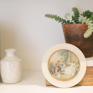
We carried the same classic neutrals into this room as the others and styled the shelves with the same collected, yet refined style. We were even able to incorporate some heirloom pieces and travel souvenirs, which always adds so much warmth and personality. Natural wood tones, perfectly placed greenery, and inviting seating made this room so much more cozy and usable.

The Dining Room
The formal dining room was exactly that—formal. We brought in an extendable wood table to fit their large family and linen upholstered chairs to tone it down, but kept the original charm. The marble hearth simply could not be replaced. While vacationing in France, the previous owner saw this beautiful, ornate fireplace in the back of a truck being hauled off to be thrown out. He rescued it, shipped it back to the states, and it found its home here in the dining room. Stories like that one add character to a home that just cannot be replicated, so we worked around it.
It was pieces like this that set the tone for certain spaces in the home; creating a more elegant feel than we typically would have gone with, but the juxtaposition makes for a truly interesting space, and good dinner conversation!


Guest Bathroom
When we began this project, the guest bathroom was just a powder room, but we knew for this house to meet our clients’ needs, it would need to become a full bathroom. The homeowners love having their extended family over and we wanted to give them a space that felt functional for hosting guests.

This small room underwent quite the transformation. Originally, it was a very intense space that didn’t function very well. Right off the bat, we ditched the poor reproduction vanity cabinet and mega sink so people could actually wash their hands. We borrowed the space for the shower from the super deep closet in the adjacent guest bedroom and it hasn’t been missed at all. We found flooring that was a close match to the French limestone of the entryway and carried that into the bathroom. The black and white color scheme is timeless, and the vintage artwork adds the perfect amount of warmth and interest. It’s easy to use and very easy to look at!

Upstairs Landing
This was another one of those areas that was significant, not because it was in the “heart” of the home, but because it would be walked through daily to get to other rooms. It could have easily become an afterthought, but instead it became the common area that ties all of the upstairs bedrooms together. It’s a great spot to read a book and the beautiful built-ins are full of family memories, treasured artwork, and mementos. I think that small spaces like this one feeling complete and cohesive is what makes a truly well-designed home.


We carried the same colors and overall feel into this area as in the other rooms of the home: comfortable and classic with layered shelves and lots of textural goodness.
That’s it for part II! If you haven’t already, click over to part I to see the entry and all-important family room + kitchen. And, stay tuned for part III where I’ll take you inside the dreamy bedrooms and the grandkid-friendly playroom.


.png)
Comments